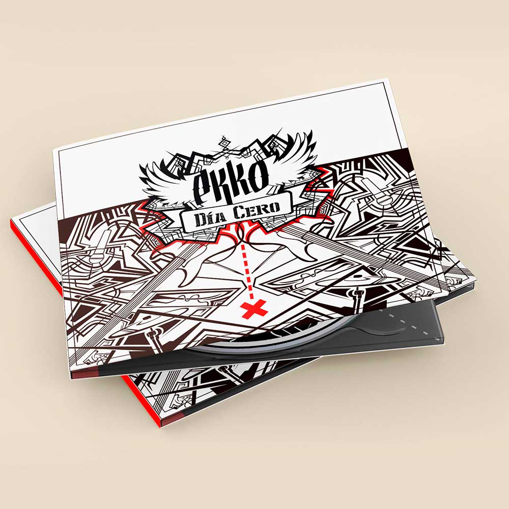
Ekko is a music group from Vic. Which commissioned me to design his first LP and then the layout of the second.
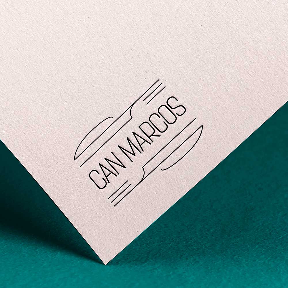
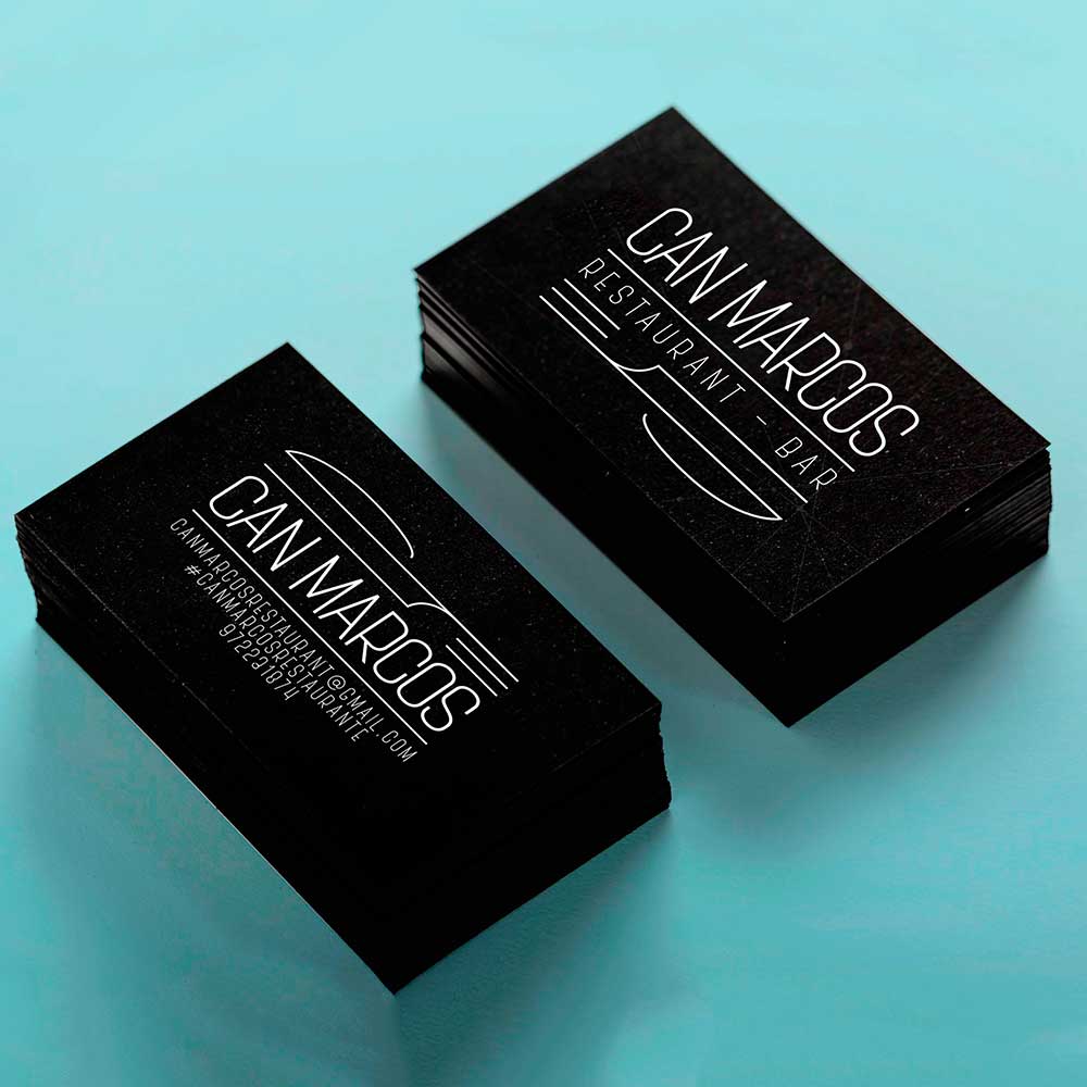
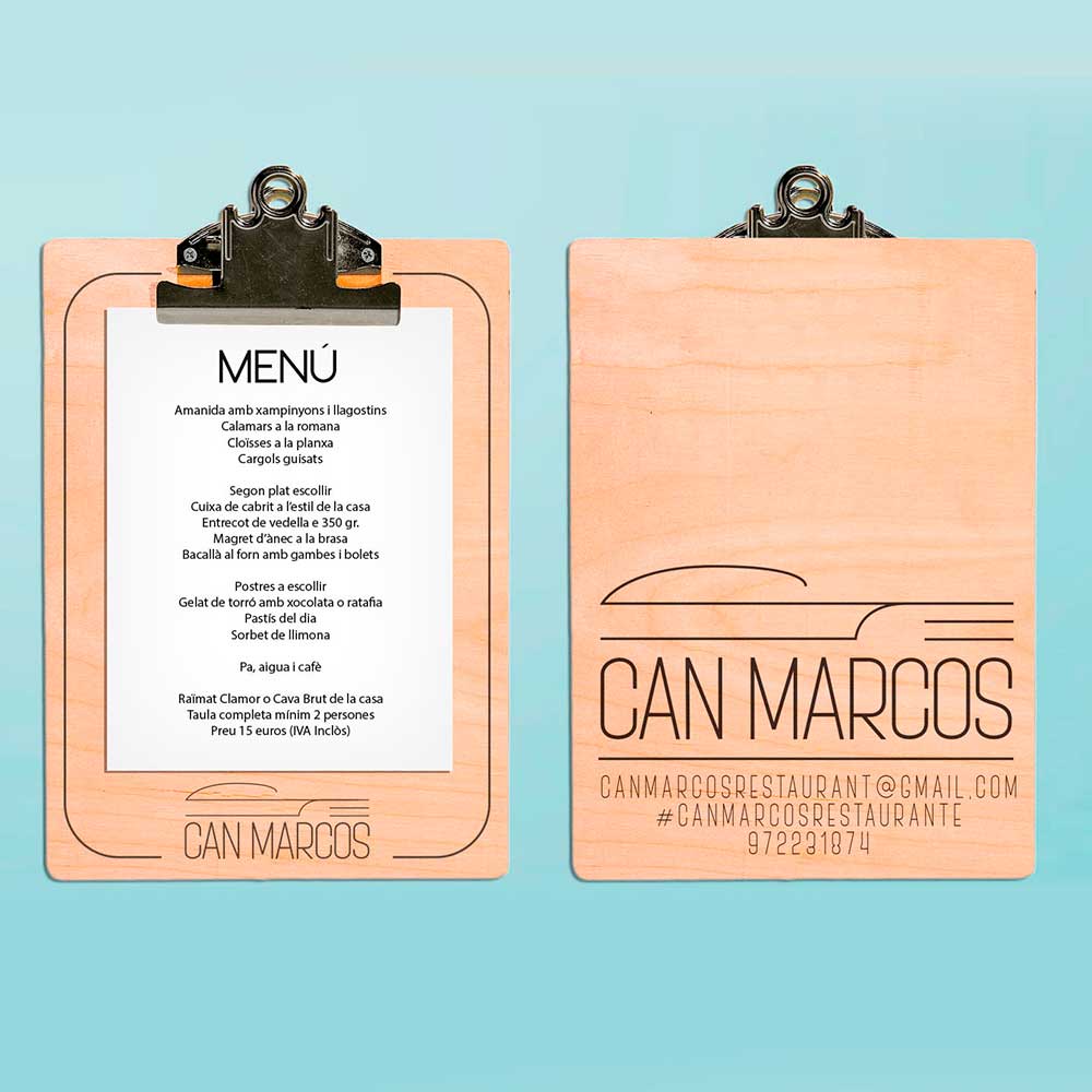
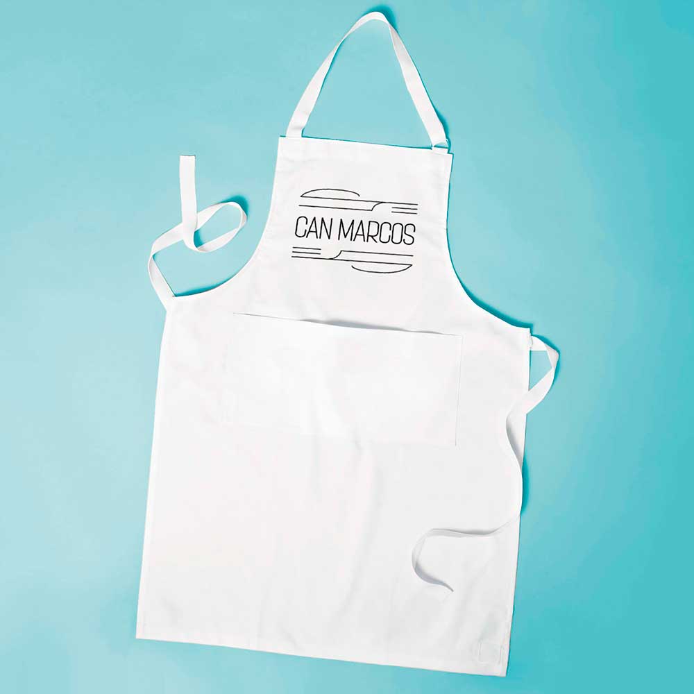
Can Marcos is a restaurant in Girona, where I redesigned the brand and made different proposals for its application.
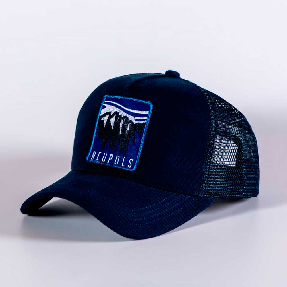
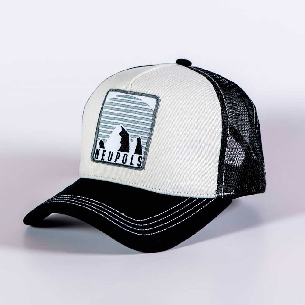
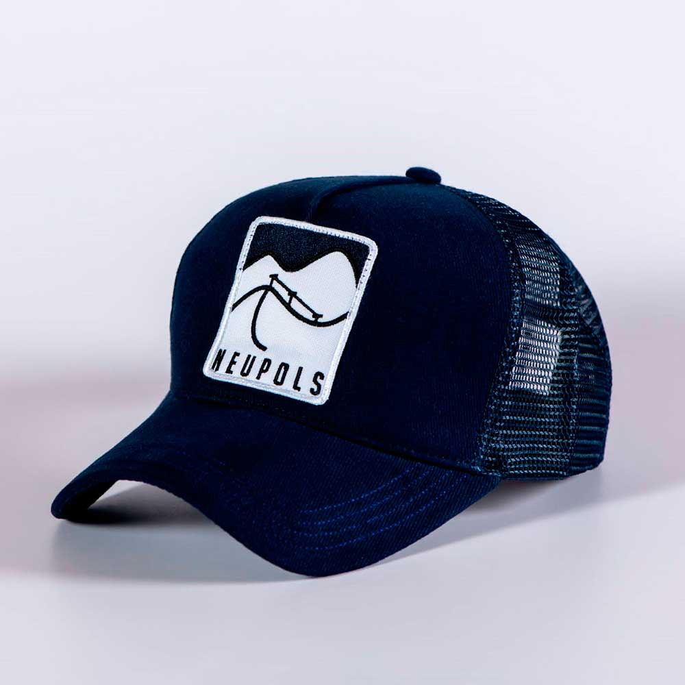
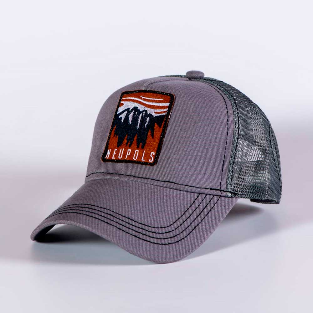
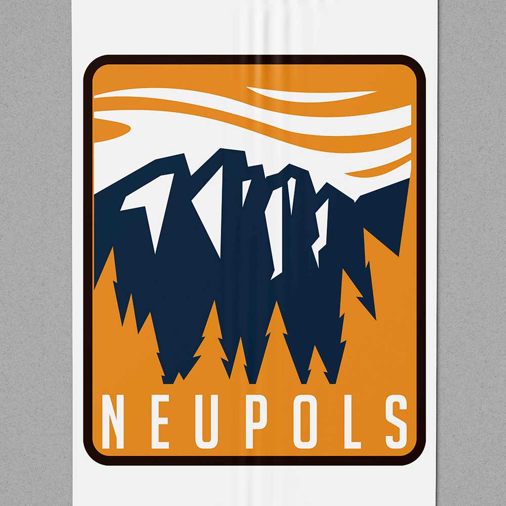
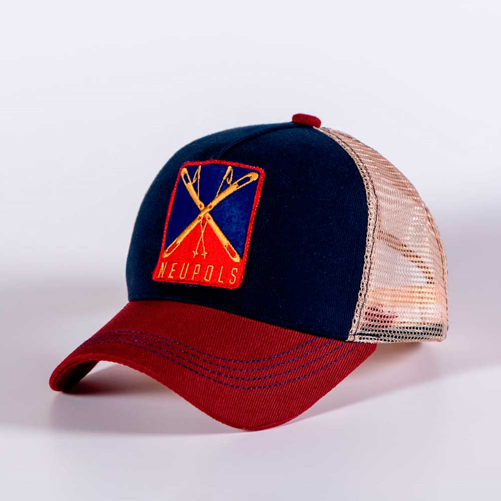
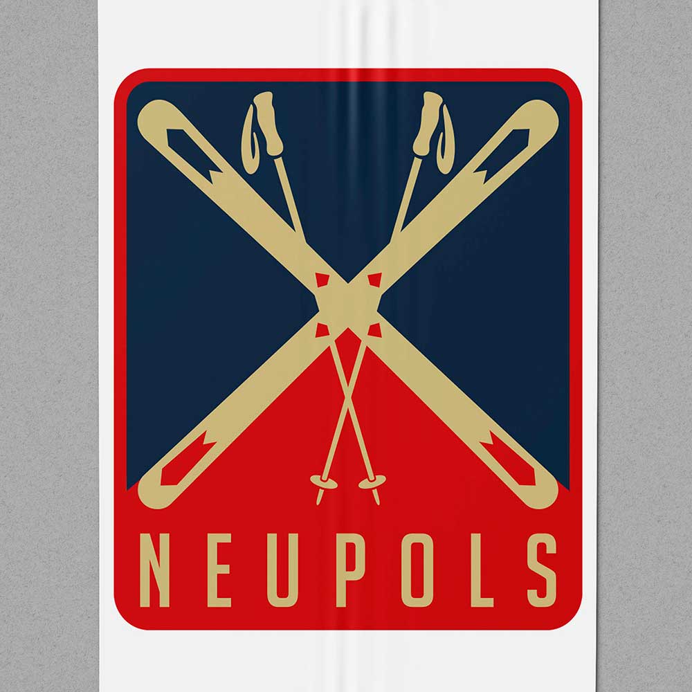
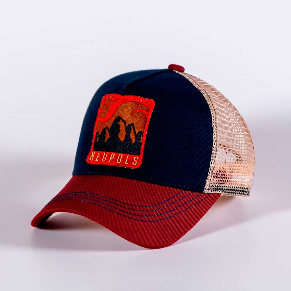
Neupols is a clothing brand in the Pyrenees. They ordered me a line of hats.
El Pont de Pedra is a restaurant in Girona, of which I will show you two blackboards that I ordered.
Personal brand for a creative from Girona
Graphic material for a hostel in Phnom Penth
Ekko
Dia Cero
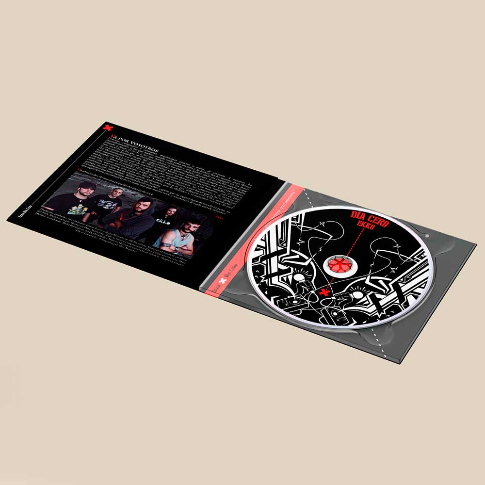
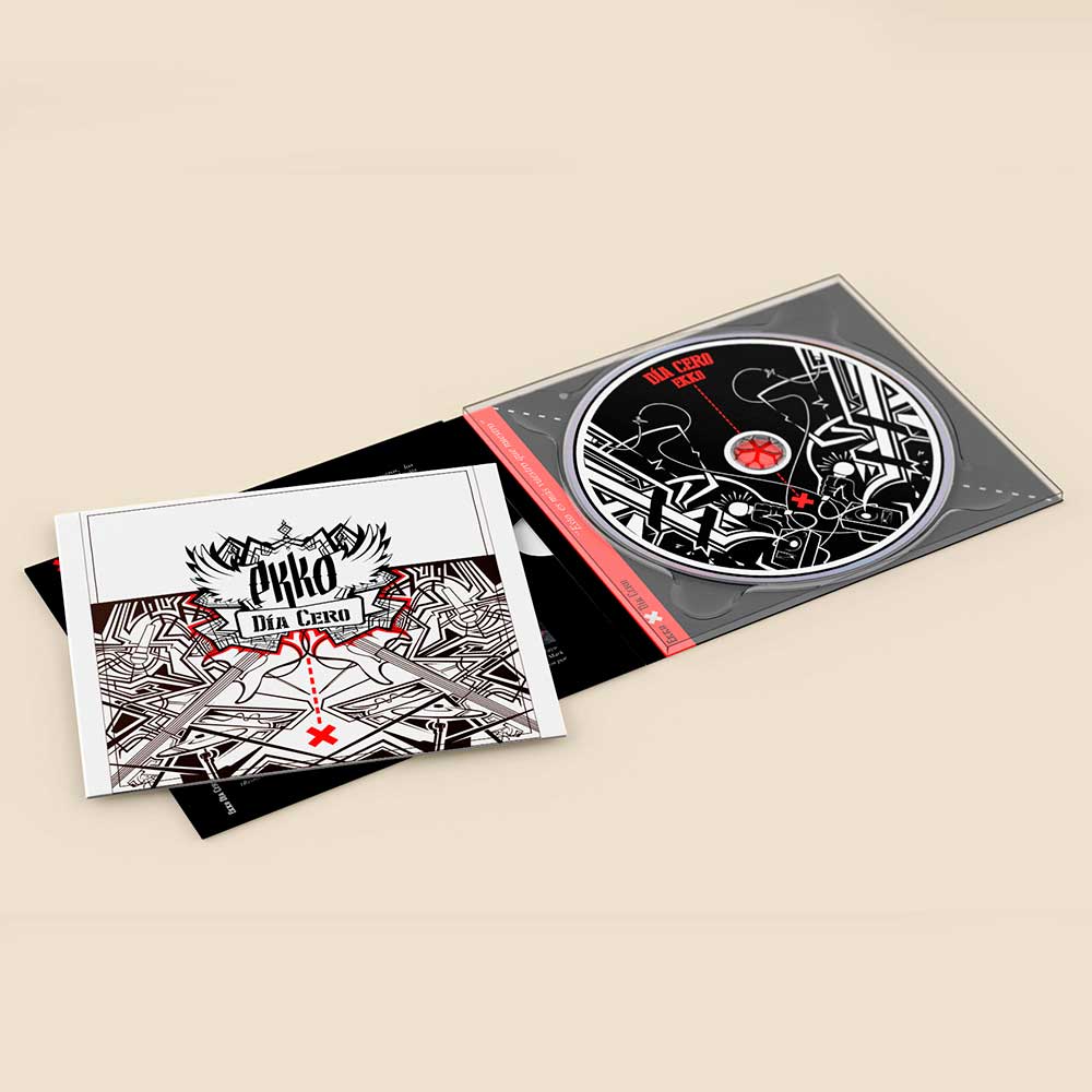
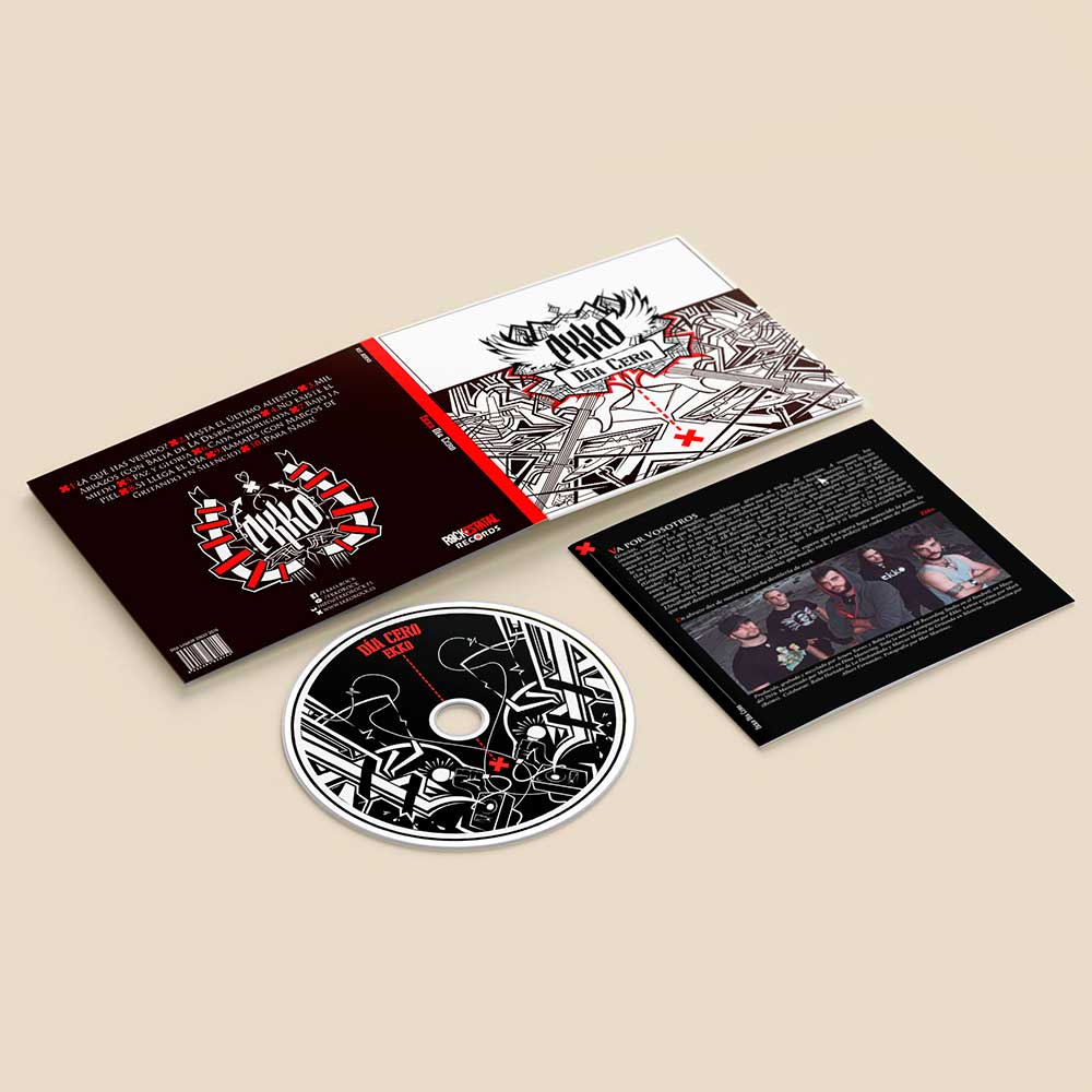
‘Dia Cero’ is the first collaborative project in which the band and I worked together, as well as their very first LP.
Objective: the band’s vision at that time involved distancing themselves from the rock aesthetic of the last 20 years, and put themselves on the map as a fresh Spanish rock band. They needed a complete Digipack, with a booklet that would include lyrics, acknowledgements, and legal and commercial information.
Resolution: the instruments, sensations and vibes the band experienced on stage (as told by them) were illustrated vectorially in two colours.
The drawings are meant to breathe the energy, aggressiveness and ornate touch characteristic of their music into the graphic work.
I created an imagotype made up of lettering with the band’s name against a winged background, and framed the album title on a ribbon underneath, thus conveying their visual identity, which is neither symmetrical nor consistent with the vectorial aesthetic of the rest of the album. In addition, the imagotype is set apart from the other elements in the front-cover by means of a red frame which draws a dotted line that stops at a mark, thus symbolising the LP’s title ‘Dia Cero’ (‘Day Zero’, the beginning).
The tasks I conducted in this project included its illustration, layout, and supervision of its printout.
Notes: the imagotype was further employed in all sorts of merchandising items, especially clothing apparel.
Tools: all illustrations were made using ‘Illustrator’, and the layout ‘Indesign’.
Las leyes de su jauria
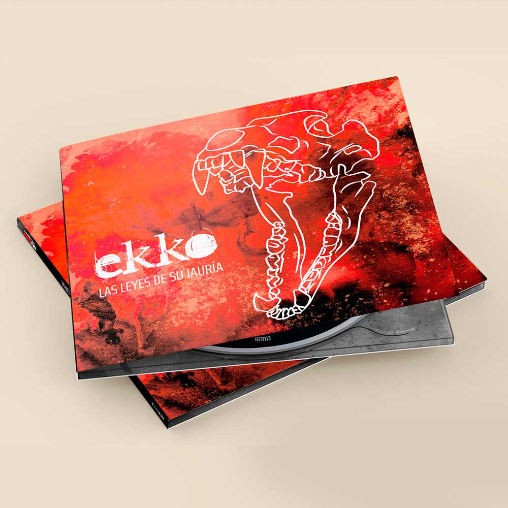
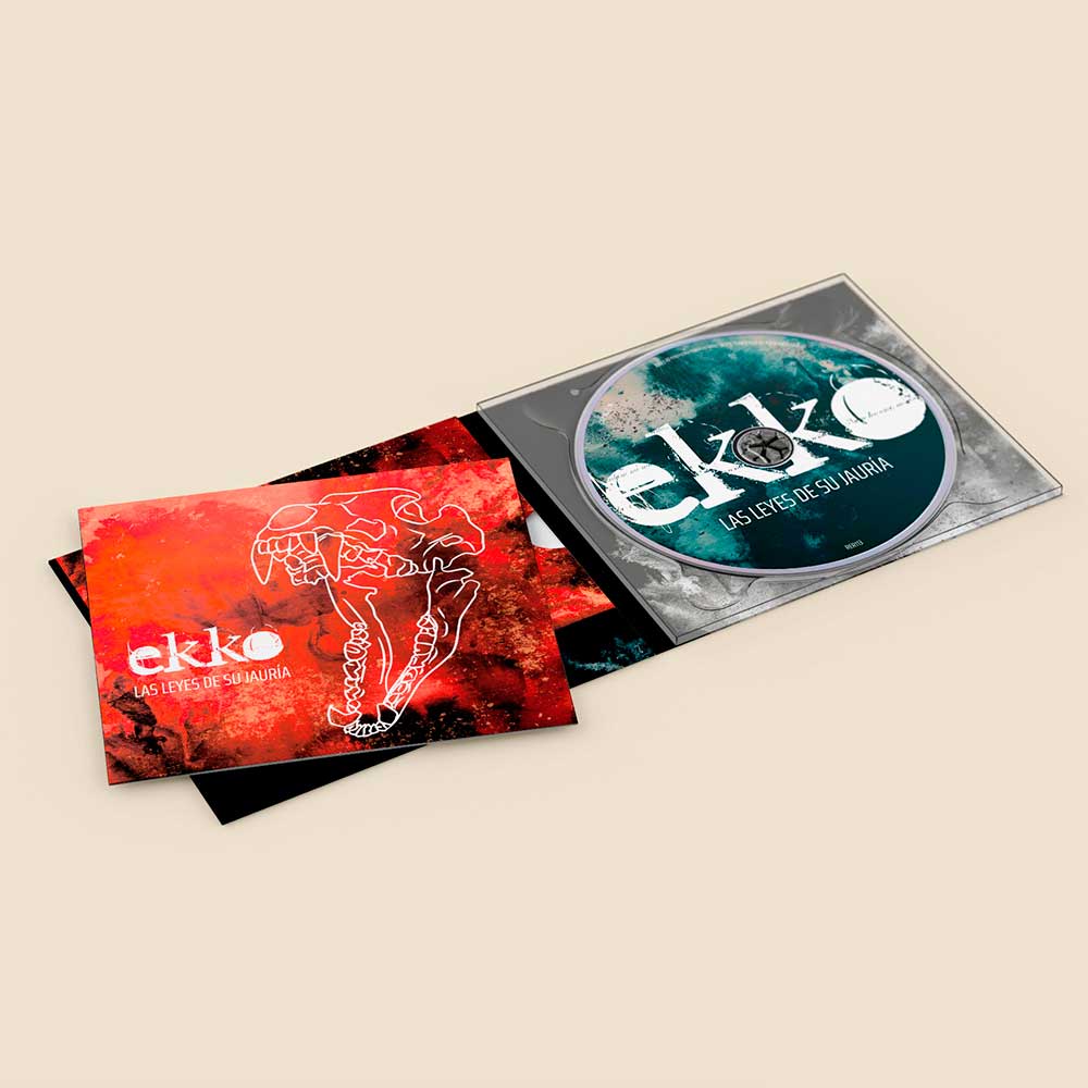
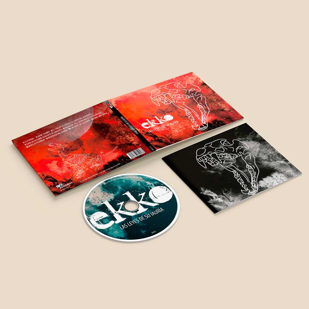
Ekko’s second LP. This work had a different sound, so I employed a different aesthetic.
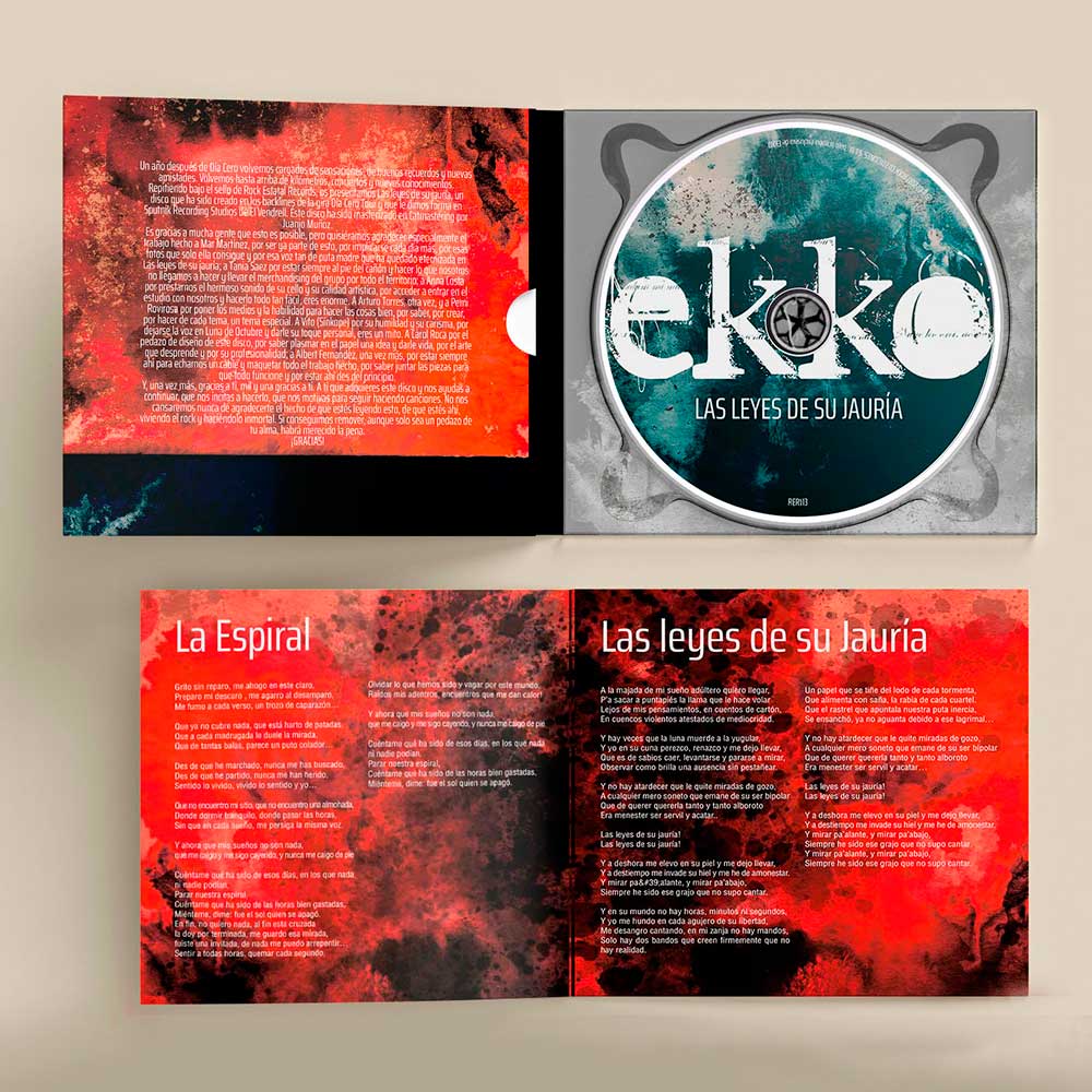
Objective: the project involved the very same tasks as their first LP: the design of a Digipack with a booklet. This album aimed at consolidating the band’s presence in the Spanish rock scene.
Resolution: this time the project was shared with an illustrator who sent me the design of the skull and the different textures. This allowed me to focus on the composition process and layout of the album, in which photographs were excluded so as to obtain an introspective theme. In order to do so, I created several designs, each with a unique style, both for the booklet and the label.
Tools: the booklet was made using ‘Indesign’, and both the Digipack and CD label using ‘Illustrator’.
Can Marcos
The new owner of ‘Can Marcos Restaurant’ wanted to emphasize the establishment’s change of direction. He needed a new image that would distance itself from the kind of restaurant it had been before, and so take control of the project in his own way.
Objective: I was asked to design an imagotype that would work best with his idea of modernising the restaurant’s image and, at the same time, that could be used effectively on different items.
Resolution: the client was very clear about the graphic style he wanted: fine lines, modern, and comprehensible. Still, he gave me a lot of freedom and we saw eye to eye right away. I utilised a typeface which, despite being dry and delicate, was conspicuous enough to allow me to keep it in the foreground. This was accompanied with the blending of a drawn fork and knife, which formed the isotype. The rest of task was to present different versions of the imagotype providing different information.
Tools: the brand and cards were created using ‘Illustrator’.
Neupols
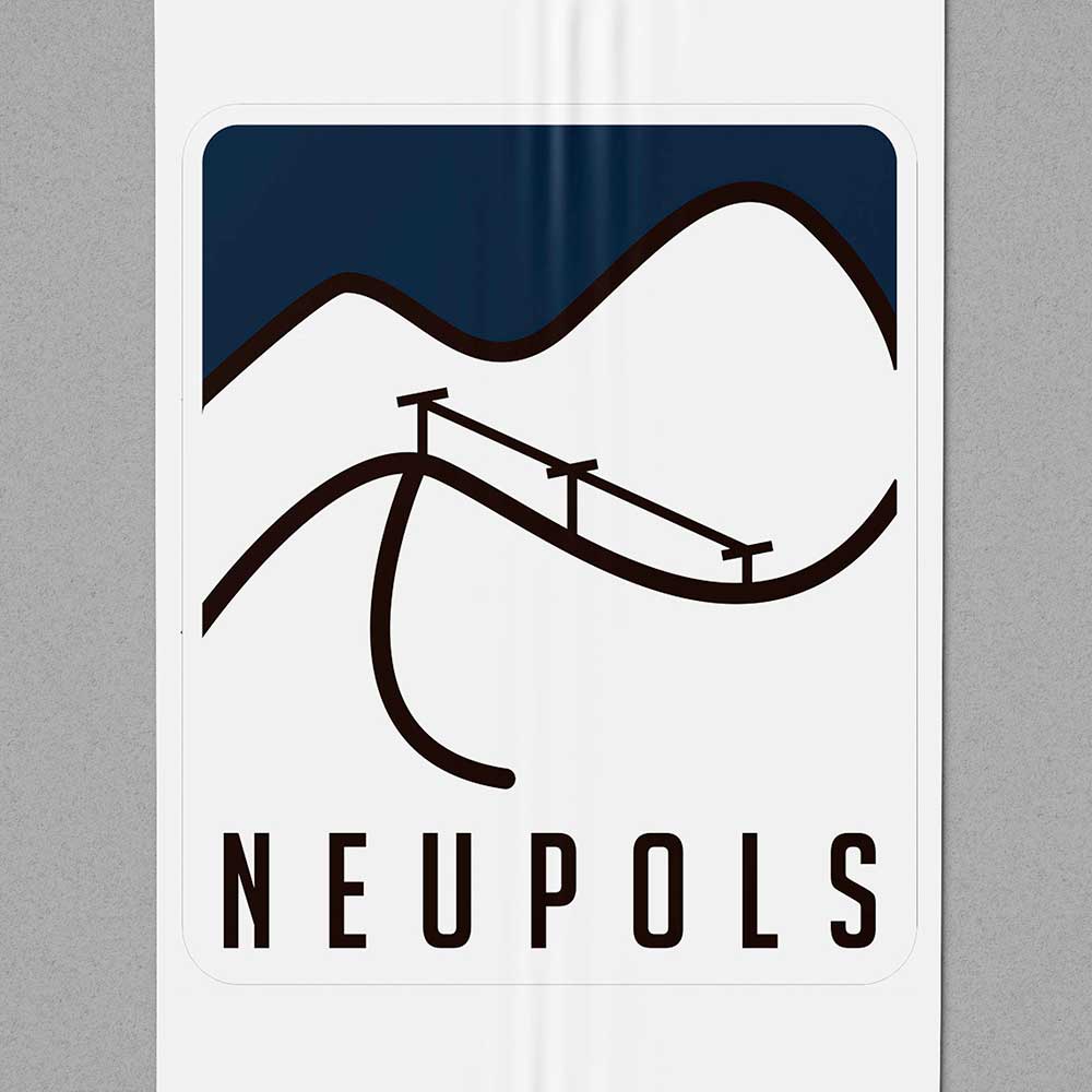
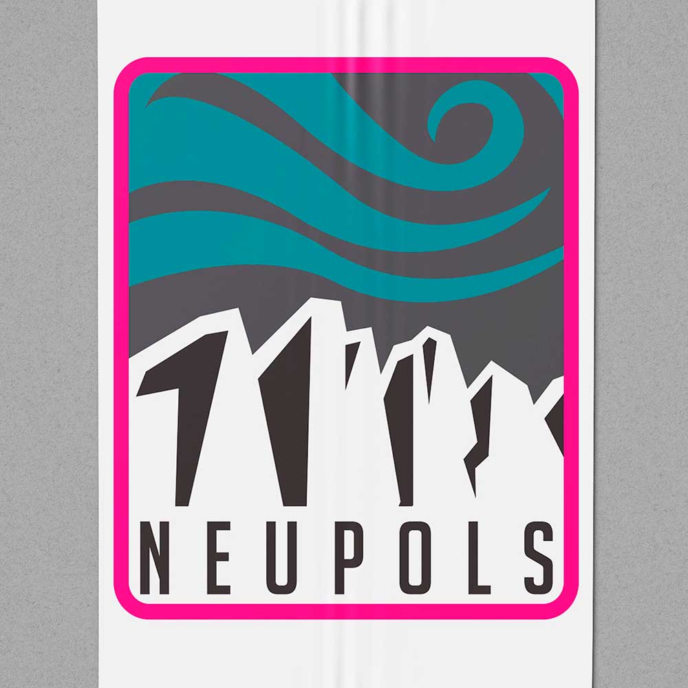
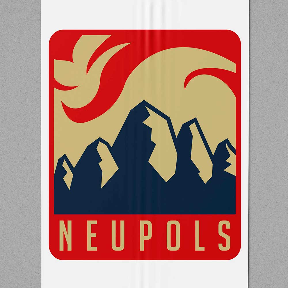
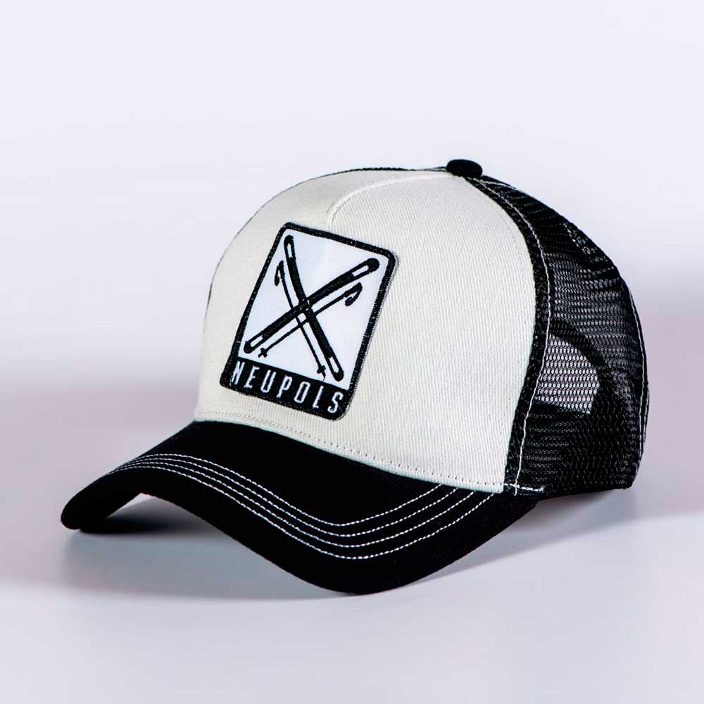
‘Neupols’ wanted to release a set of highly-demanded caps, and they contacted me to carry out the overall design.
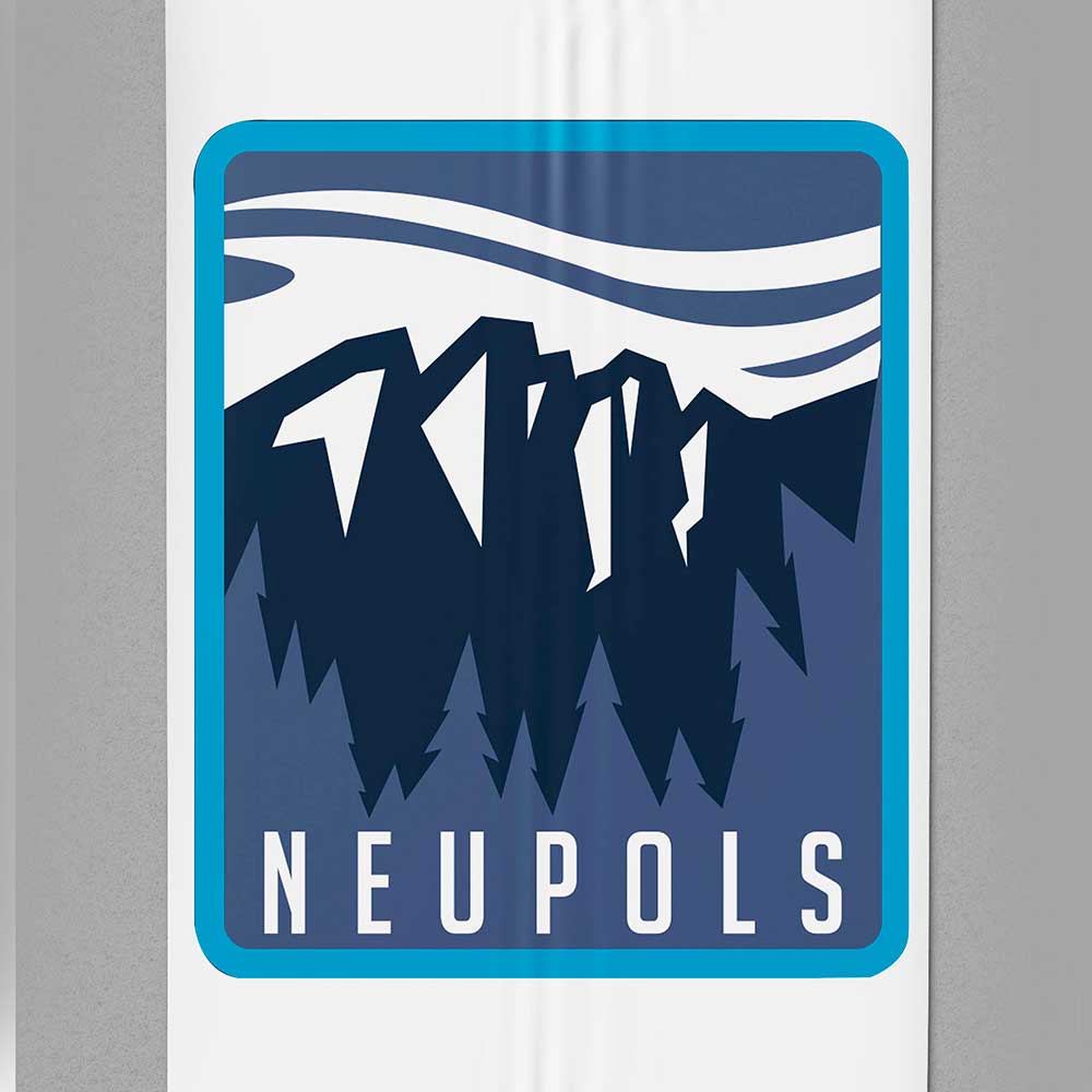
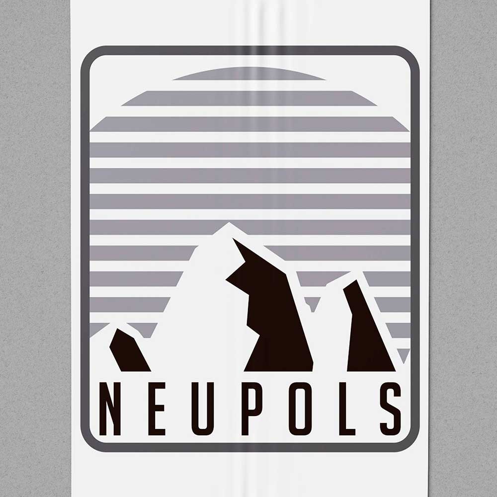
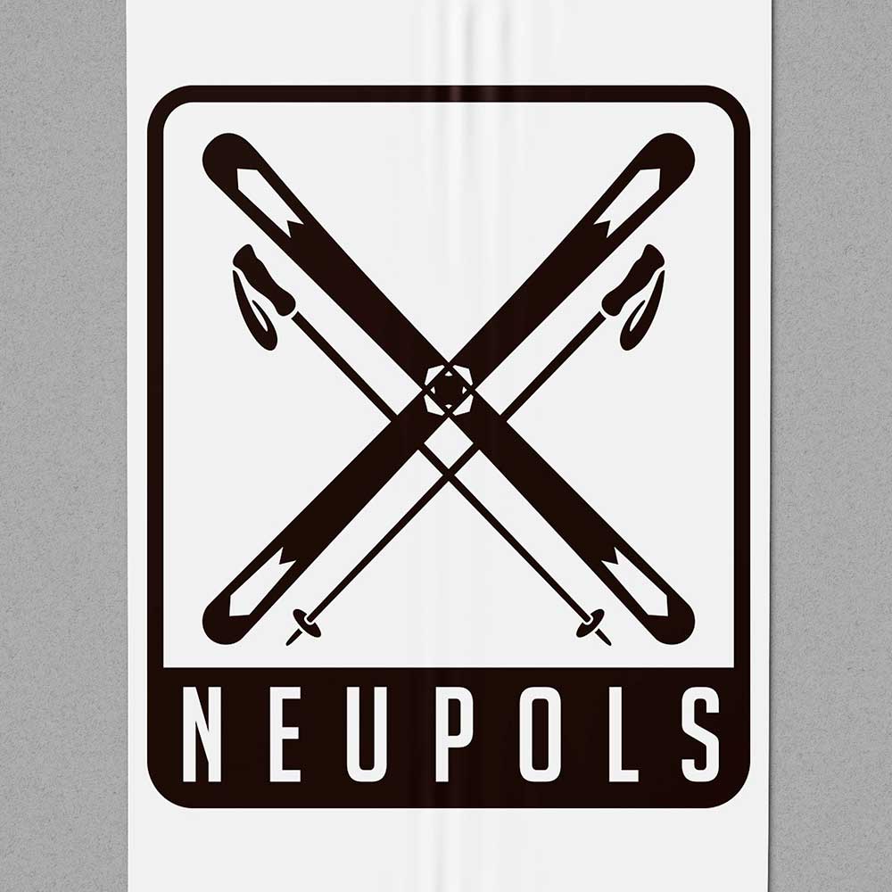
Objective: a series of 9 caps with an embroidered design on a patch. All items included the brand name, and followed a stylistic theme revolving around skiing and other mountain-related sports.
Resolution: The fact that the finish is in embroidery quite limits the detail and type of illustration that could be applied to it. I did a quick search of different types of cap with similar finishes, and once I had a clear idea, I looked for different photographs to draw inspiration for the drawings, as well as to extract a minimal-colour palette.
The illustration of the patches is very much given by the rectangular format of these, playing with the frame, integrating it to make it pass off as part of the same drawing, or demarcating it in contrast to the rest.
Notes: I had no colour limit, but this being a line of caps that were sold together I decided to use a palette quite in line with the thematic focus, though always different for each cap.
About six months later the caps were sold out.
Pont de pedra
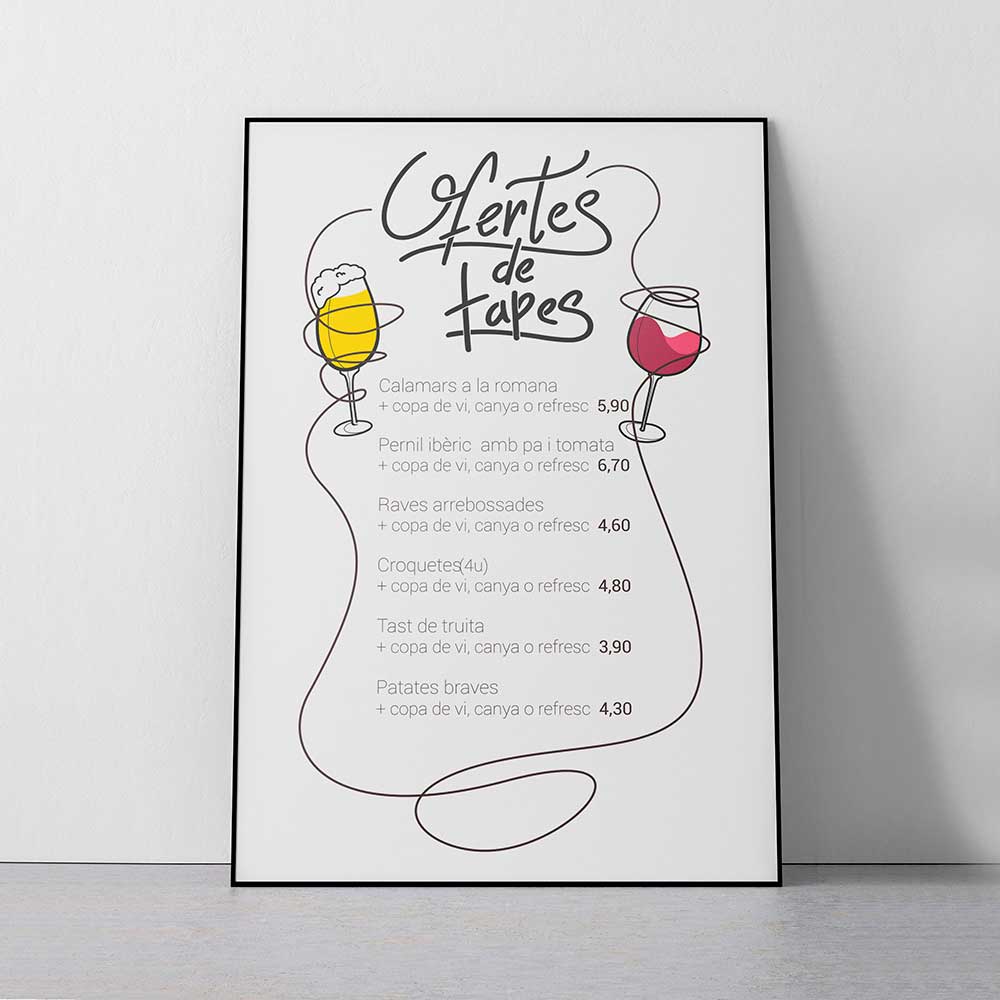
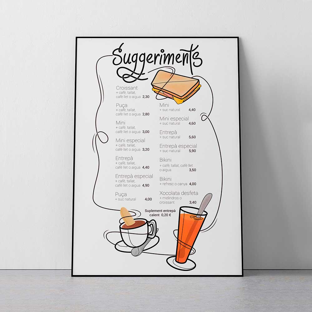
The coffee shop needed to boost its sales outside the main shifts, and wanted to do so in a personal fashion, thus distancing itself from the close-by competition.
Objective: the order consisted of two boards that would go on display both in the street and inside the establishment. The urge to stand out is given by the business’ location, for it stands in direct competition with many restaurants that, unlike ‘Pont de Pedra’ whose usual customers are the workers of the area, are rather tourist-oriented.
Resolution: inspecting the competition I noticed that most of the menus are photography-based, or strictly grounded to the concrete aesthetics of the place, be it related to an English tavern or to an Italian pizzeria. On this basis, I decided to choose a different approach and not draw the offers and suggestions very specifically.
Firstly, I drew each of the elements of the offers in a cartoonish and informal style in order to make an informed choice as to which ones would fit best within the aesthetics of the board. I composed them along with the lettering and a frame of carefree strokes in the specific sizes of the physical support, as they already had the boards and had to fit in them.
The text that describes the offers and the price follows the style of the menu that they already had, but does not clash with the whole board.
Tools: the illustrations were created using ‘Procreate’ and the layout of the elements using ‘Indesign’.
Mr. Sheppard
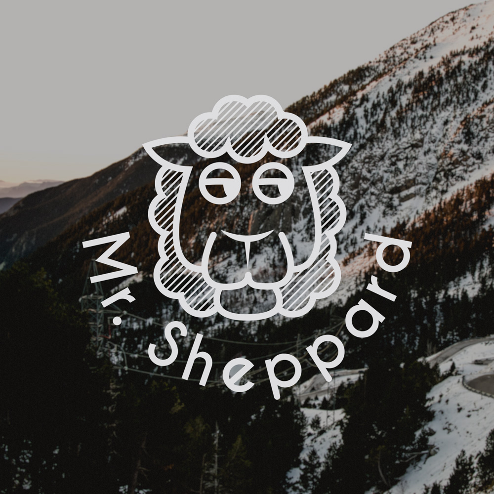
The personal brand of a copywriter from Girona.
Objective: he needed a brand that would work on different formats, be it digital or in the variety of products he could offer in the future. At that time, he did not have a clear and defined business line, but rather several ideas which required a personal and modern signature.
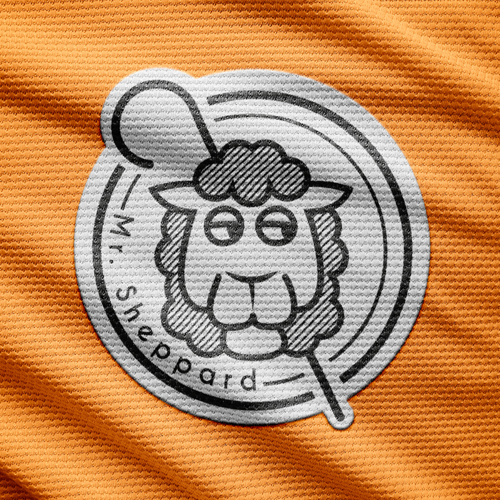
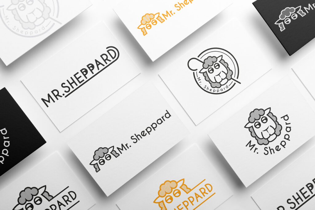
Resolution: the process starts off with the illustration of the lamb, which makes a direct reference to the brand name, and to which I adapted the typography. The lamb is given a certain attitude, thus trying to personify it and make it closer. Out of this, various versions of the logo are created, each including different compositions and giving importance to the imagotype or isotype according to the format. It is a flexible solution that imbues versatility to the brand when it comes to its presentation.
Tools: both the drawing and lettering were made using ‘Illustrator’.
Eghty8
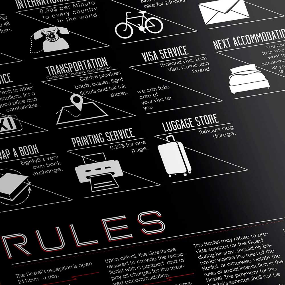
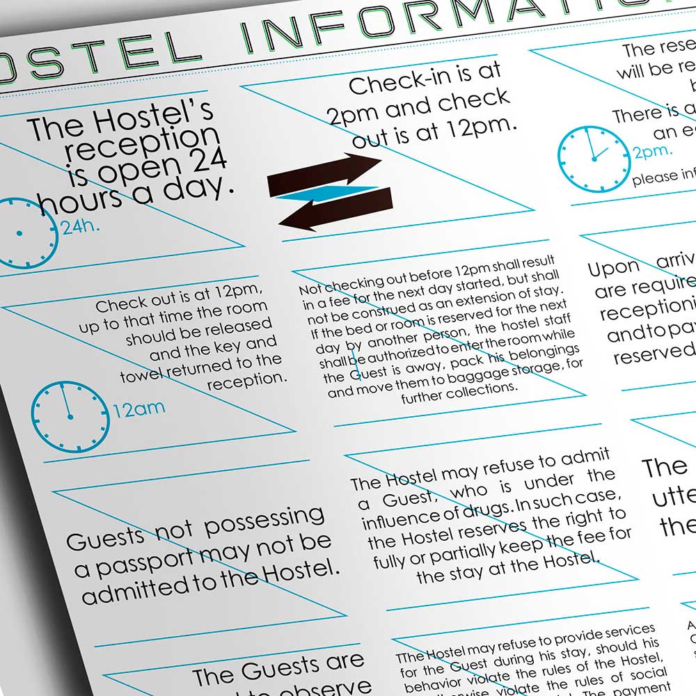
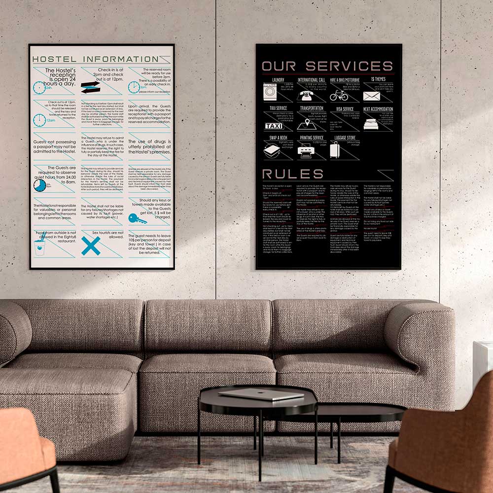
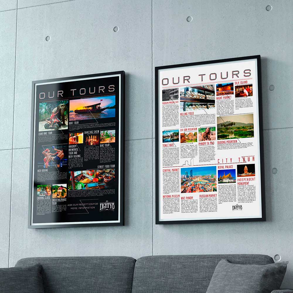
I spent some time at Phnom Penth, where I lodged at ‘Eighty8’ hostel. It is one of the best-value-for-money accommodations in the city. During my stay, I was asked to solve different communication issues the hostel management had with the customers. The following are some panels I created for the hostel’s front desk.
Objective: due to miscommunication problems caused by language barriers, the staff needed a fast, efficient, and effective way to inform the guests about the hostel standard procedures, new features, management decisions and services offered.
Resolution: since the amount of information that was to be included was quite extensive, we decided to create 4 A1 panels, each with different pieces of information. That is, two panels informing the guests about the tours offered by the hostel, and the other two about the hostel rules, services, and procedures.
I wanted to introduce an element that would unify all the information and give a graphic line to the whole beyond the typography. After several trials, the one I found most convincing was the inverted ‘Z’, which serves manifold purposes: underlining the title, framing an information block, as well as dividing the differents parts of the panel, among others. Once the graphic line was chosen, I added a small iconographic-style drawing for each block.
Following the aesthetics of most of the hostel’s graphic media, the panels contrast with each other. Therefore, two of them are white and the other two are black, and are alternated on the wall.
The layout process was the most entertaining part of the project as each block required specialized attention, either to match the text to the image or to make it fit within the block.
Notes: I worked on several projects and initiatives with them (e.g., menus for the restaurant, special-day promotions, and other graphic material), yet they never wanted a redesign of the logo, which greatly limited the quality of any work that could be done.
Tools: the iconography and decorative elements were designed using ‘Illustrator’, the layout using ‘Indesign’, and the editing of the photographs using ‘Photoshop’.
